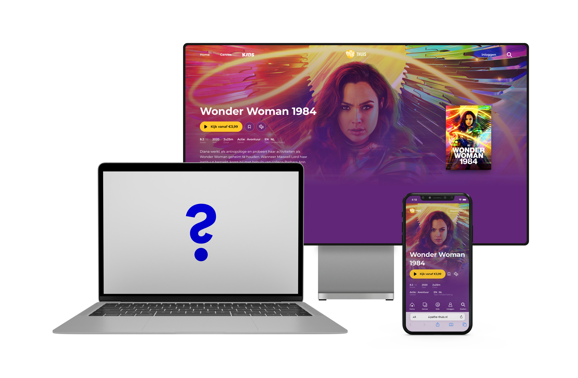
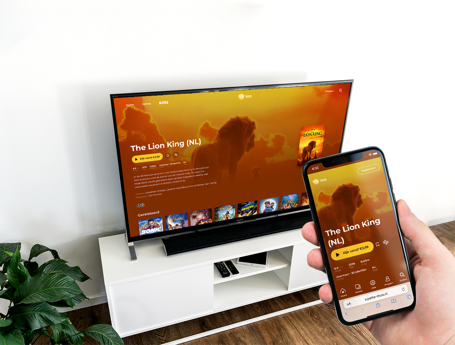
The same smooth user experience on the website as in the app
The Challenge: transform the website of Pathé Thuis into a user-friendly and alluring video-on-demand platform.
Pathé Thuis has grown into one of the biggest video-on-demand platforms in the Netherlands. When they launched, they had worked hard on a user-friendly app for mobile devices, as well as for the television. On the web everything worked functionally, but the user experience was lagging behind on the apps. For example, it was not yet possible to watch a film on a mobile phone via the website.
The new website is fully responsive and offers all available functionalities including movie playback from mobile devices to laptops and desktop.The backend, that was steady. The design was also ready. It was now up to us to ensure a smooth and alluring user experience.
The Solution: a team of experts using the newest web technology
Let’s start with a team of experts. Together with the developers of Egenig, Pathé Thuis developed a backend where the apps of hundreds of thousands of mobile phone and televisions could connect to. The designers from Plus Drie joined as experts to design a smooth video-on-demand experience. With our frontend specialists, the team was complete and ready to transform the website into an intuitive and user-friendly miracle.
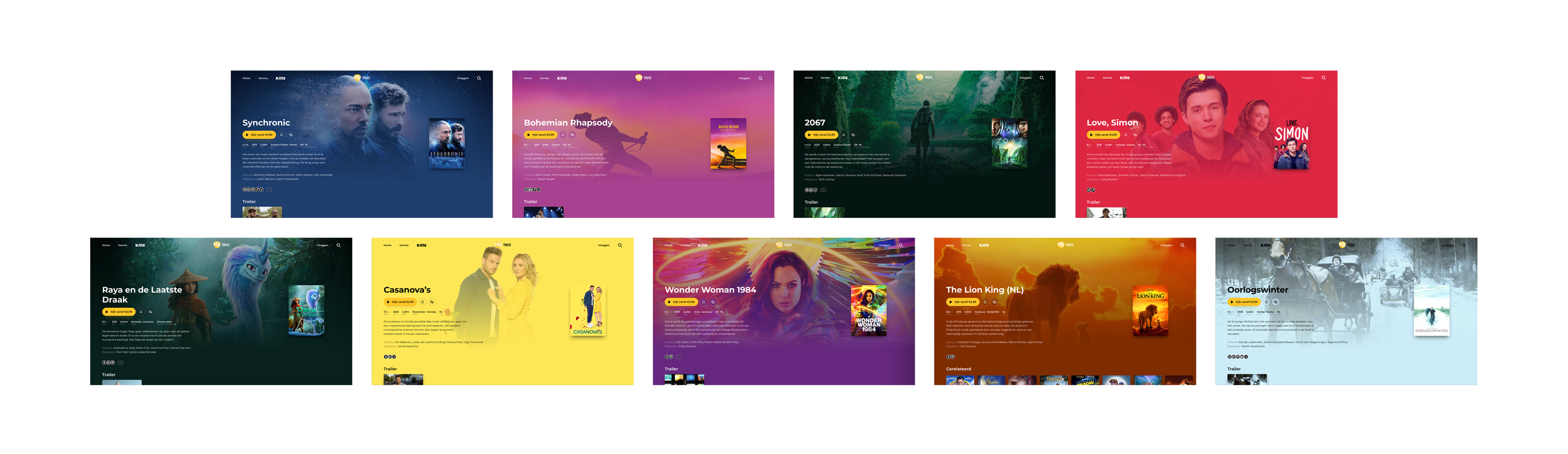
Captivating Design
In order to make the website as user-friendly and attractive as possible, we used:
Screen filling covers – with text colours that adapt to the film poster for extra contrast. Now you feel the love when clicking on a romcom, and the sensation when clicking the newest James Bond film.
Smooth Scrollers – The goal of the design was to be smooth, remember? So, a pleasant, fast website, that keeps up with you no matter how fast you scroll through those movies.
Animations – To really bring the website to life, we used animations. This makes the experience even more captivating
The Result: Effortlessly watch a movie wherever and whenever you like on the website of Pathé Thuis. A smooth and fast user-experience from selecting to watching a film.
