Within the Dutch Public Broadcasting (NPO) a project was started in 2015 to develop a number of pilots based on ‘big data’. One of those pilots was the development of a dashboard for editorial staff to get direct insight into visitor/viewer statistics and trends CleverLions, the contractor of this project, asked us to build this configurable dashboard.
The challenge: build a prototype based on complex data
The NPO is a complex media organisation. Not just television programmes are produced here, it’s also the home of the NOS news station and hosts numerous message boards that draw large visitor numbers. Each of their editorial staffs uses distinct software. Sometimes featuring a modern API, sometimes none at all. Getting access to its data is a big challenge.
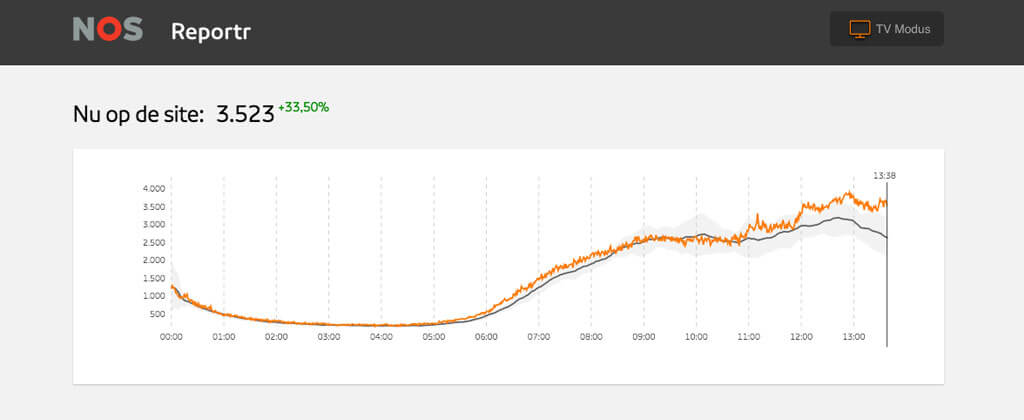
NPO wants to provide all staff with a dashboard that displays similar information (visitor numbers, social network shares, trending posts, et cetera) we need an API that normalises all variations. Text called headerin one instance and caption in the other will be named title in our API. More importantly, all this data needs to be as realtime as possible. Only when a trend develops literally before their eyes, the editorial staff can intervene or engage on time.
To give insight into this data, we need a balance between scanability and the amount of information present on the dashboard at once. To achieve this, we used recognisable iconography, photos, diagrams and pie charts.
Finally, this was all about building a prototype: we aimed to learn about the NPO’s data flow and be able to work out ideas quickly.
Together with GoDataDriven’s big data experts and Hike One’s designers we took off.
The solution: work iteratively and demand driven
An important part of the dashboard is that it would become actionable for editorial staffs. On the other hand we had a heap of data begging us to experiment with it. By continuously asking questions, do a lot of demos and write flexible code we kept our focus.
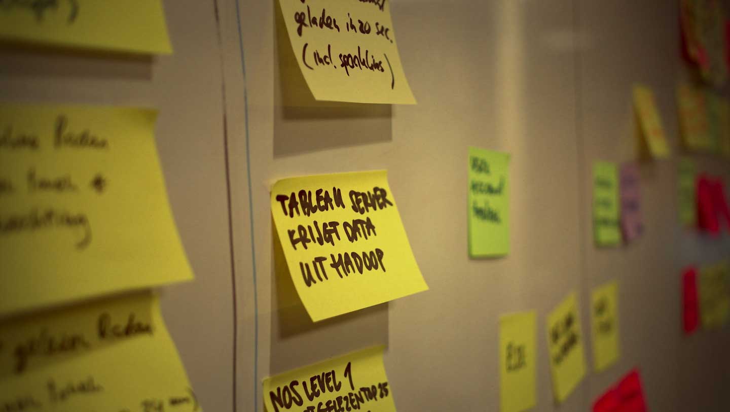
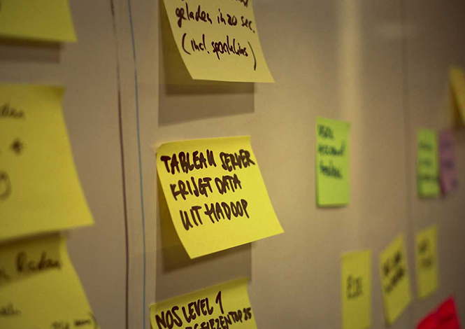
API built to fit the front-end
The largest challenges were mainly in the back-end: getting data accessible, normalisation, analytics and building an API for the front-end. What that API should be is probably best dictated by what is displayed on the dashboard. Because data access was a complex issue, we decided to be very selective. We had many discussions with back-end developers about what information should be available in which format. Besides achieving our goal, we made the front-end fast, because the API was perfectly cut to size.
Microframework for quick iterations
To be able to develop quickly, it’s a good idea to choose something off the shelf without compromising development velocity. We chose Riot: optimised for modular development and very flexible. We made sure every part of a page can update itself with newly available data. Titles, layout and positioning of statistics and lists on the page are configurable. To complete the dashboard, we built a ‘TV mode’ version with large graphics on a dark background, specially suited for large screens in editorial offices.
With this approach, we were able to quickly experiment with the information displayed.
Visual is better
People are very visually oriented. To show that one article is doing better than the next, we display them in an ordered list. If Facebook is getting more shares than Twitter, that’s immediately insightful with a pie chart diagram.
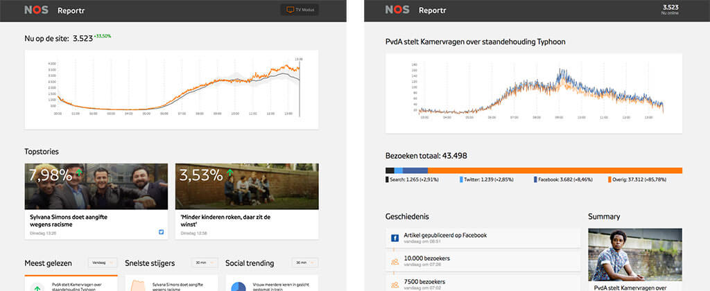
In an early iteration, we mostly used text and red or green-colored percentages. As the project progressed, we decided to switch to stronger visualisation. With D3.js we were able to quickly show charts, diagrams and ‘sparklines’. This made things a lot more clear.
In July 2016 the TopSpin project came to its conclusion with a large presentation, and the birth of a new department. This department is responsible for big data and data visualisation solutions within NPO. We are proud to have contributed to this result.