Our secrets revealed to getting a blazing fast website
We recently updated our site. Yes, it has a complete design overhaul, but as real software developers we focused a lot on the technical bits and pieces as well. Our goal was to take control, focus on performance, be flexible for the future and make it fun to write content for the site. Here’s how we made our website faster than yours (Yup, sorry!)
Design for performance
In our projects we have daily discussions with designers and product owners about balancing aesthetics and performance. For our own site, this was easy. Simply said: we believe that a good user experience starts with delivering content as fast as possible. That means performance > aesthetics.
Good content, layout, images, and interactivity are essential for engaging your audience, but each of these elements have impact on page load time and the end-user experience. In every step we looked at how we could get a nice user experience and design while having minimum impact on performance.
Content first
We want to serve the core content — meaning copy with the essential HTML and CSS — to our visitors as fast as possible. Every page should support the primary purpose of the content: get the message across. Enhancements, meaning JavaScript, complete CSS, web fonts, images and analytics are inferior to the core content.
Take control
After defining the standards we set for our ideal site, we concluded that we needed full control over every aspect of the site. We chose to build our own static site generator, including asset pipeline, and host it ourselves.
Static site generator
We’ve written our own static site generator in Node.js. It takes Markdown files with short JSON page meta descriptions to generate the complete site structure with all of its assets. It can also be accompanied by a HTML file for including page-specific JavaScript.
See below a simplified meta description and markdown file for this blog post, used to generate the actual HTML.
The JSON meta description:
{
  "keywords": ["performance", "critical rendering path", "static site", "..."],
  "publishDate": "2016-07-13",
  "authors": ["Declan"]
}
And the markdown file:
# Why our website is faster than yours
We've recently updated our site. Yes, it has a complete...

## Design for performance
In our projects we have daily discussions...
Image delivery
The average webpage is a whopping 2406kb of which 1535kb are images. With images taking up such a big part of the average website, it is also one of the best targets for performance wins.
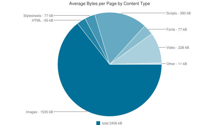
Average bytes per page by content type for July 2016 from httparchive.org
WebP
WebP is a modern image format that provides superior lossless and lossy compression for images on the web. WebP images can be substantially smaller than images of other formats: sometimes they are up to 25% smaller than their JPEG counterpart. WebP is overlooked a lot and not often used. At the time of writing, WebP support is limited to Chrome, Opera and Android (still over 50% of our users), but we can degrade gracefully to JPG/PNG.
<picture> element
Using the picture element we can degrade gracefully from WebP to a more widely supported format like JPEG:
<picture>
  <source type="image/webp" srcset="image-l.webp" media="(min-width: 640px)">
  <source type="image/webp" srcset="image-m.webp" media="(min-width: 320px)">
  <source type="image/webp" srcset="image-s.webp">
  <source srcset="image-l.jpg" media="(min-width: 640px)">
  <source srcset="image-m.jpg" media="(min-width: 320px)">
  <source srcset="image-s.jpg">
  <img alt="Description of the image" src="image-l.jpg">
</picture>
We use picturefill by Scott Jehl to polyfill browsers not supporting the <picture> element and to get consistent behaviour across all browsers.
We use the <img> as a fallback for browsers not supporting the <picture> element and/or JavaScript. Using the image’s largest instance makes sure it still looks good in the fallback scenario.
Generate
While the image delivery approach was in place, we still had to figure out how to painlessly implement it. I love the picture element for what it can do, but I hate writing the snippet above. Especially if I have to include it while writing content. We don't want to bother with generating 6 instances of every image, optimising the images and writing <picture>elements in our markdown. So we:
- generate multiple instances of the original images in our build process, both in the input format (JPG, PNG) as in WebP. We use gulp responsive to do so.
- minify the generated images
- write
in our markdown files. - use custom written Markdown renderers during the build process to compile conventional markdown image declarations to full blown
<picture>elements.
SVG animations
We chose a distinct graphic style for our site, in which SVG illustrations play a major role. We did this for several reasons.
- Firstly, SVG's (vector images) tend to be smaller than bitmap images;
- Secondly SVG's are responsive by nature and scale perfectly while always staying super crisp. So no need for image generation and
<picture>elements; - Last but not least we can animate and alter them by CSS! A perfect example of designing for performance. All our portfolio pages have a custom made animated SVG that is reused on the overview page. It serves as a recurring style for all our portfolio items making the design consistent, while having very little impact on performance.
Check out this animation and how we can alter it with CSS.
Custom web fonts
Before diving in, here’s a short primer on browser behaviour regarding custom web fonts. When the browser comes across a @font-facedefinition in CSS that points to a font not available on the user’s computer, it will try to download this font file. While the download happens, most browsers don’t display the text using this font. At all. This phenomenon is called the “Flash of Invisible Text” or FOIT. If you know what to look for, you will find it almost everywhere on the web. And if you ask me, it is bad for the end-user experience. It delays the user in reaching their core goal: reading the content.
We can however force the browser to change its behaviour into a “Flash of Unstyled Content” or FOUT. We tell the browser to use an ubiquitous font at first, like Arial or Georgia. Once the custom web font is downloaded it will replace the standard font and re-render all text. If the custom font fails to load, the content is still perfectly readable. While some might consider this a fallback, we see custom fonts as an enhancement. Even without it, the site looks fine and works 100%. Just toggle our custom fonts by checking/unchecking the checkbox and see for yourself:
Using custom web fonts can benefit the user experience, as long as you optimise and serve them responsibly.
Font subsetting
Subsetting is by far the quickest win in improving webfont performance. I would recommend it to every web developer using custom fonts. You can go all out with subsetting if you have complete control over the content and know which characters will be displayed. But even just subsetting your font to "Western languages" will have a huge impact on file size. For example, our Noto Regular WOFF font, which is 246KB by default, drops to 31KB when subsetted to Western languages. We used the Font squirrel webfont generator which is really easy to use.
Font face observer
Font face observer by Bram Stein is an awesome helper script for checking whether fonts are loaded. It is agnostic as to how you load your fonts, be it via a webfont service or hosting them yourself. After the font face observer script notifies us that all custom web fonts are loaded, we add a fonts-loaded class to the <html> element. We style our pages accordingly:
html {
   font-family: Georgia, serif;
}

html.fonts-loaded {
   font-family: Noto, Georgia, serif;
}
Note: For brevity, I did not include the @font-face declaration for Noto in the CSS above.
We also set a cookie to remember that all fonts are loaded, and therefore live in the browser’s cache. We use this cookie for repeating views, which I will explain a bit later.
In the near future we probably do not need Bram Stein’s JavaScript to get this behaviour. The CSS Working Group has proposed a new @font-facedescriptor (called font-display), where the property value controls how a downloadable font renders before it is fully loaded. The css statement font-display: swap would give us the same behaviour as the approach above. Read more on the font-display property.
Lazy load JS and CSS
Generally speaking we have an approach of loading in assets as soon as possible. We eliminate render blocking requests and optimise for the first view, leveraging the browser cache for repeated views.
Lazy load JS
By design, we do not have a lot of JavaScript in our site. For what we do have, and what we intend to use in the future, we developed a JavaScript workflow.
JavaScript in the <head> blocks rendering, and we don't want that. JavaScript should only enhance the user experience; it is not critical for our visitors. The easy way to fix the render blocking JavaScript is to place the script in the tail of your webpage. The downside is that it will only start downloading the script after the complete HTML is downloaded.
An alternative could be to add the script to the head and defer the script execution by adding the defer attribute to the <script> tag. This makes the script non-blocking as the browser downloads it almost immediately, without executing the code until the page is loaded.
There is just one thing left, we don't use libraries like jQuery and thus our JavaScript depends on vanilla JavaScript features. We only want to load JavaScript in browsers supporting these features. The end result looks like this:
<script>
if ('querySelector' in document && 'addEventListener' in window) {
  document.write('<script src="index.js" defer><\/script>');
}
</script>
We place this little inline script in the head of our page detecting whether the vanilla JavaScript document.querySelector and window.addEventListener features are supported. If so, we load the script by writing the script tag directly to the page, and use the deferattribute to make it non-blocking.
Lazy load CSS
For the first view the biggest render blocking resource for our site is CSS. Browsers delay page rendering until the full CSS file referenced in the <head> is downloaded and parsed. This behaviour is deliberate, otherwise the browser would need to recalculate layouts and repaint all the time during rendering.
To prevent CSS from render blocking, we need to asynchronously load the CSS file. We use the awesome loadCSS function by the Filament Group. It will give you a callback when the CSS file is loaded, where we set a cookie stating that the CSS is loaded. We use this cookie for repeating views, which I will explain a bit later.
There is one ‘problem’ with loading in CSS asynchronously, in that while the HTML is being rendered really fast it will look like plain HTML with no CSS applied, until the full CSS is downloaded and parsed. This is where critical CSS comes in.
Critical CSS
Critical CSS can be described as the minimum amount of blocking CSS to make a page appear recognisable for the user. We focus on ‘above the fold’ content. Obviously the location of the fold differs greatly between devices, so we make a best guess.
Manually determining this critical CSS is a time consuming process, especially during future style changes. There are several nifty scripts for generating critical CSS in your build process. We used the magnificent critical by Addy Osmani.
See below our homepage rendered with critical CSS and rendered with the full CSS. Notice the fold where below the fold the page is still sort of unstyled.

On the left the homepage rendered with only critical CSS, on the right the homepage rendered with the full CSS. The red line representing the fold.
The server
We host de Voorhoede site ourselves, because we wanted to have control over the server environment. We also wanted to experiment how we could boost performance by changing server configuration. At this time we have an Apache web server and we serve our site over HTTPS.
Configuration
To boost performance and security we did a little research on how to configure the server.
We use H5BP boilerplate apache configuration, which is a great start for improving performance and security for your Apache web server. They have configurations for other server environments as well.
We turned on GZIP for most of our HTML, CSS and JavaScript. We set caching headers neatly for all our resources. Read about that below in the file level caching section.
HTTPS
Serving your site over HTTPS can have a performance impact for your site. The performance penalty is mainly from setting up the SSL handshake, introducing a lot of latency. But — as always — we can do something about that!
HTTP Strict Transport Security is a HTTP header that lets the server tell the browser that it should only be communicated with using HTTPS. This way it prevents HTTP requests from being redirected to HTTPS. All attempts to access the site using HTTP should automatically be converted. That saves us a roundtrip!
TLS false start allows the client to start sending encrypted data immediately after the first TLS roundtrip. This optimization reduces handshake overhead for new TLS connections to one roundtrip. Once the client knows the encryption key it can begin transmitting application data. The rest of the handshake is spent confirming that nobody has tampered with the handshake records, and can be done in parallel.
TLS session resumption saves us another roudtrip by making sure that if the browser and the server have communicated over TLS in the past, the browser can remember the session identifier and the next time it sets up a connection, that identifier can be reused, saving a round trip.
I sound like a dev ops engineer, but I’m not. I just read some things and watched some videos. I loved Mythbusting HTTPS: Squashing security’s urban legends by Emily Stark from Google I/O 2016.
Use of cookies
We don't have a server side language, just a static Apache web server. But an Apache web server can still do server side includes (SSI) and read out cookies. By making smart use of cookies and serving HTML that is partially rewritten by Apache, we can boost front-end performance. Take this example below (our actual code is a little more complex, but boils down to the same ideas):
<!-- #if expr="($HTTP_COOKIE!=/css-loaded/) || ($HTTP_COOKIE=/.*css-loaded=([^;]+);?.*/ && ${1} != '0d82f.css' )"-->

<noscript><link rel="stylesheet" href="0d82f.css"></noscript>
<script>
(function() {
    function loadCSS(url) {...}
    function onloadCSS(stylesheet, callback) {...}
    function setCookie(name, value, expInDays) {...}

    var stylesheet = loadCSS('0d82f.css');
    onloadCSS(stylesheet, function() {
        setCookie('css-loaded', '0d82f', 100);
    });
}());
</script>

<style>/* Critical CSS here */</style>

<!-- #else -->
<link rel="stylesheet" href="0d82f.css">
<!-- #endif -->
The Apache server side logic are the comment looking lines starting with <!-- #. Let's look at this step by step:
$HTTP_COOKIE!=/css-loaded/checks if no CSS cache cookie exists yet.$HTTP_COOKIE=/.*css-loaded=([^;]+);?.*/ && ${1} != '0d82f.css'checks if the cached CSS version is not the current version.- If
<!-- #if expr="..." -->evaluates totruewe assume this is the visitor’s first view. - For the first view we add a
<noscript>tag with a render blocking<link rel="stylesheet">. We do this, because we will load in the full CSS asynchronously with JavaScript. If JavaScript would be disabled, this would not be possible. This means that as a fallback, we load CSS ‘by the numbers’, ie. in a blocking manner. - We add an inline script with functions for lazy loading the CSS, an
onloadCSScallback and set cookies. - In the same script we load in the full CSS asynchronously.
- In the
onloadCSScallback we set a cookie with the version hash as cookie value. - After the script we add an inline stylesheet with the critical CSS. This will be render blocking, but it will be very small and prevent the page from being displayed as plain unstyled HTML.
- The
<!-- #else -->statement (meaning thecss-loadedcookie is present) represents the visitor’s repeating views. Because we can assume to some degree that the CSS file is loaded previously we can leverage browser cache and serve the stylesheet in a blocking manner. It will be served from the cache and load almost instantly.
The same approach is used for loading in fonts asynchronously for the first view, assuming we can serve them from browser cache for repeating views.
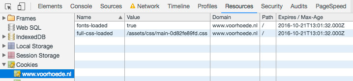
See here our cookies used to differentiate between first and repeated views.
File level caching
Since we depend heavily on browser caching for repeating views, we need to make sure we cache properly. Ideally we want to cache assets (css, js, fonts, images) forever, only invalidating the cache when a file actually changes. Cache is invalidated if the request URL is unique. We git tagour site when we release a new version, so the easiest way would be to add a query parameter to request URLs with the code base version, like https://www.voorhoede.nl/assets/css/styles.css?v=1.0.4. But.
The disadvantage of this approach is that when we would write a new blog post (which is part of our code base, not externally stored in a CMS), cache for all of our assets would be invalidated, while no changes have been made to those assets.
While trying to level up our approach, we stumbled upon gulp-rev and gulp-rev-replace. These scripts helped us to add revisioning per file by appending a content hash to our filenames. This means the request URL only changes when the actual file has changed. Now we have per-file cache invalidation. This makes my heart go boom boom!
Result
If you’ve come this far (awesome!) you probably want to know the result. Testing how performant your site is can be done with tooling like PageSpeed Insights for very practical tips and WebPagetest for extensive network analysis. I think the best way to test your site rendering performance is by watching your page evolve while throttling your connection insanely. That means: throttle in a probably unrealistic manner. In Google Chrome you can throttle your connection (via the inspector > Network tab) and see how requests are slowly being loaded in while your page builds up.
So see here how our homepage loads on a throttled 50KB/s GPRS connection.
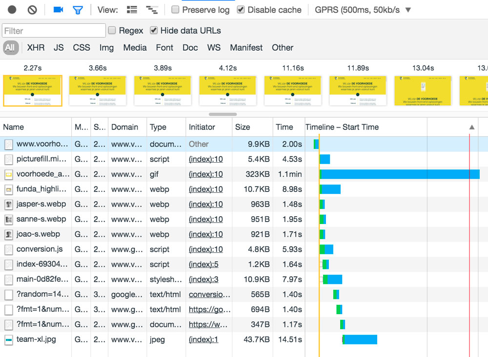
An overview of how the page evolves for the first visit
Notice how we get the first render at 2.27s on a 50KB/s GPRS network, represented by the first image from the filmstrip and the corresponding yellow line on the waterfall view. The yellow line is drawn right after the HTML has been downloaded. The HTML contains the critical CSS, making sure the page looks usable. All other blocking recources are being lazily loaded, so we can interact with the page while the rest is being downloaded. This is exactly what we wanted!
Another thing to notice is that custom fonts are never loaded on connections this slow. The font face observer automatically takes care of this, but if we wouldn't load in fonts asynchronously you would be staring at FOIT for a while in most browsers.
The full CSS file is only loaded in after 8 seconds. Conversely, if we’d loaded the full CSS in a blocking manner instead of having critical CSS inline, we would have been staring at a white page for 8 seconds.
If you’re curious how these times compare to other websites with less of a focus on performance, go for it. Load times will go through the roof!
Testing our site against the tools mentioned earlier shows some nice results as well. PageSpeed insights gives us a 100/100 score for mobile performance, how awesome is that!
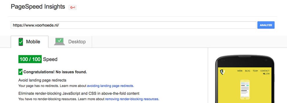
Woohoo! 100/100 on speed
When we look at WebPagetest we get the following result:
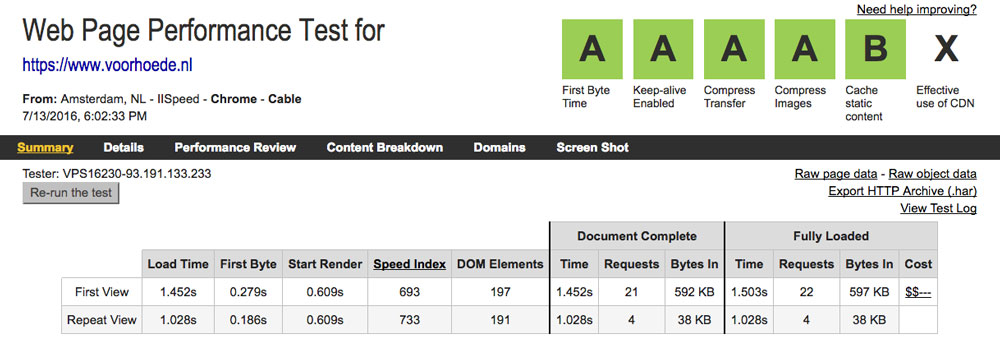
WebPagetest results for voorhoede.nl
We can see that our server performs well and that the SpeedIndex for the first view is 693. This means our page is usable after 693ms on a cable connection. Looking good!
Roadmap
We are not done yet and are constantly iterating on our approach. We will focus in the near future on:
-
HTTP/2: It's here and we are currently experimenting with it. A lot of things described in this article are best practices based on the limitations of HTTP/1.1. In short: HTTP/1.1 dates from 1999 when table layouts and inline styles were super awesome. HTTP/1.1 was never designed for 2.6MB webpages with 200 requests. To alleviate our poor old protocol’s pains we concatenate JS and CSS, inline critical CSS, use data URI's for small images, et cetera. Everything to save requests. Since HTTP/2 can run multiple requests in parallel over the same TCP connection, all this concatenation and reducing of requests might even prove to be an antipattern. We will move to HTTP/2 when we are done with running experiments.
-
Service Workers: This is a modern browser JavaScript API that is run in the background. It enables a lot of features that were not available for websites before, like offline support, push notifications, background sync and more. We are playing around with Service Workers, but we still need to implement it in our own site. I guarantee you, we will!
-
CDN: So, we wanted control and hosted the site ourselves. Yes, yes, and now we want to move to a CDN to get rid of network latency caused by the physical distance between client and server. Although our clients are mostly based in the Netherlands, we want to reach the worldwide front-end community in a way that reflects what we do best: quality, performance, and moving the web forward.
Thanks for reading! Do you have comments or questions? Let us know via Twitter.