We’ve come a long way in terms of animation on the web. The first animations on the web were GIFs. Then jQuery.animate() came along to create custom animations. The current state of animation uses animation libraries, like GreenSock Animation Platform and Velocity. Ofcourse, CSS has had @keyframe animation for a while, but there hasn’t been a good interface to connect that to JavaScript. This has finally changed!
The Web Animations API (or WAAPI) landed in all modern browsers. What does this imply for you as a front-end developer? We played around with this feature. In this blog we provide you with the insights you need for creating effective animations.
The footprint of animation libraries
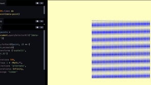
The modern-day web is mobile-first. So, we want to send as little data as possible. But at the same time we want a better interface with animations. For example: have a checkout where selected items fly into a shopping basket. Is putting a JS animation library into your project worth it? To give you a hint, check out the footprint of commonly used libraries down below
- Anime.js: 6.9 kb
- GSAP: 23.2 kb
- Mo.js: 35.4 kb
- Velocity-animate: 15.5 kb
- Popmotion: 7.1kb
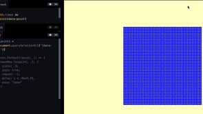
Native animation implementation
We ran stress-tests for both the WAAPI and GSAP. The result? The stress-test for GSAP runs more slowly than the WAAPI one. Why? Because updating DOM nodes is cost-intensive for the browser in terms of painting and rendering.
Reasons to use the WAAPI
The WAAPI has 4 major benefits in comparison to the traditional approach:
- The WAAPI runs off the main-thread
- Performance: no inline styles
- 0 kb to load
- Support in all modern browsers
Besides the benefits mentioned above, there are a lot of other functionalities and cases where the use of WAAPI comes in advance:
- Chaining and callbacks.This helps to develop asynchronous code keeps and prevents errors.
- Jump and seek inside keyframes to keep an overview of all the moving bits and pieces you animate.
- Define playrate, allowing more control.
- Synchronize multiple animations. Useful for running your animation across multiple devices.
- To replace JS libraries as, refactoring CSS may require more effort.
- Randomized values. For example when you have a particle system going and you go from an organized system to a chaotic one.
- Modify keyframes on the fly and therefore providing more flexibility.
- Toggle animations. Another capability which can be done easier with WAAPI.
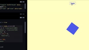
Now, the recipes. How do we get this done?
First, we go from offset on y-axis to no offset on y-axis in the transform function. Then we define the opacity, duration and the first stage (fill function).
 node.animate({
    transform: [ 'translateY(100%)', 'translateY(0%)' ],
    opacity: [ 0, 1 ],
    easing: 'ease-out',
  }, {
    duration: 1000,
    fill: 'both'
  })
This gives the following result and could be used, for example, for a menu sliding into the screen:
Now let’s do a more sophisticated and powerful example. Here, we pause tween. Otherwise it automatically runs and you want to reuse it and go back and forth every time you run it. So instead of a menu sliding into the screen each time from the bottom, you could choose to slide it out of the screen again starting from the top.
const tween = node.animate({
  transform: [ 'translateY(100%) rotate(360deg)', 'translateY(0%) rotate(0deg)' ],
  ….
}, {
 …
})

tween.pause()

function handleToggle(event) {
  event.preventDefault()

  if(initial) {
    tween.play()
    initial = false
  } else {
    tween.reverse()
  }
}
What if you want to move from one part of your website to another? The computed style of the element has to be put back into the DOM. Down below we show how to commit to style, take properties you set in keyframes and put them on the DOM element.
function animateTo(element, keyframes, options) {
const animation = element.animate(
keyframes,
{...options, fill: ‘both’}
)
animation.addEventListener(‘finish’, ( ) => {
animation.commitStyles( )
animation.cancel( )
} )
return animation
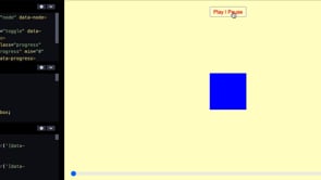
}Sometimes when you’re busy with an animation, you also want to be able to debug it. What does an animation look like in every state? What does it look like at 10% for example? To do so, we used a progress element and assigned the values to the animation and currentTime. You can combine this with a scroll position that you scrub to an animation, depending on how far someone scrolls. Everything that's normalized into a percentage can be used in animation.
progress.addEventListener(‘input’, handleProgress)

function handleProgress(event) {
  const { value } = event.target
  const progress = duration * .01 * value
  animation.currentTime = progress
}
Let’s explore the accessibility topic now. Not everyone interacts with your website in the same way. Some people like animations to be switched off, maybe because they have motion sickness or it takes too much time for them. So, let’s give them the option to switch it off or turn it down a notch in terms of duration and/or unsteadily movement. This can easily be done by adding a stagger. You don’t need to know how many items there are beforehand, since you already have styling in CSS.
const reducedMotion = window.matchMedia('(prefers-reduced-motion: reduce)').matches

const duration = reducedMotion ? .01 : 400
const stagger = reducedMotion ? 0 : 50
Finally, we have one other example where the web visitor can play around with the animation themselves.
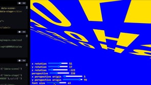
Now that you’ve had a glance of how we use the Web Animations API, try playing around with it yourself.
Want to read more about web animations?
