This post is pretty old, and might contain outdated advice or links. We’re keeping it online, but recommend that you check newer posts to see if there’s a better approach.
All blog postsFixing image reflow with fixed dimensions and fixed ratio.
Reflow is annoying. It disorients your users and it’s bad for performance. Careless implementation of images are often the cause of reflow. The good news: you can easily improve this by using fixed dimensions or a fixed aspect ratio.
What is reflow?
Reflow happens when the size of an element on the page changes. Such changes force the browser to recalculate the dimensions and position of all the elements and re-render the page. This process is browser-blocking, meaning user interaction or JavaScript can’t be processed until it’s done. Reflow can also cause parts of the page to shift or jump elsewhere. And that’s both annoying and disorienting to your users.
The image reflow issue
Browsers lazy load images by design. Until an image starts to load, the browser doesn’t know the dimensions of the image. So, on render the image causes reflow:

This happens when an image is formatted like this:
<img alt="" src="avatar.jpg">
Text next to image.
Let's fix this.
The fixed width & height fix
The browser shouldn’t have to wait for the image to be loaded to calculate its dimensions. We know which image is going to be loaded, and we know its dimensions — either by looking them up, or by requesting them from your content management system (any decent CMS can tell an image’s width & height). So we can specify the width and height directly on the image tag:
<img alt="" src="avatar.jpg"
     width="40" height="40">
Text next to image.
The fixed dimensions prevent reflow:
Fixed image dimensions prevent text reflow.
Note that we’ve also given our image a background color so it looks like a decent placeholder while the image loads.
The responsive image issue
In responsive designs we change our image markup to deliver images at an optimal size using the picture element:
Text above image
<picture>
<!-- multiple <source>s here -->
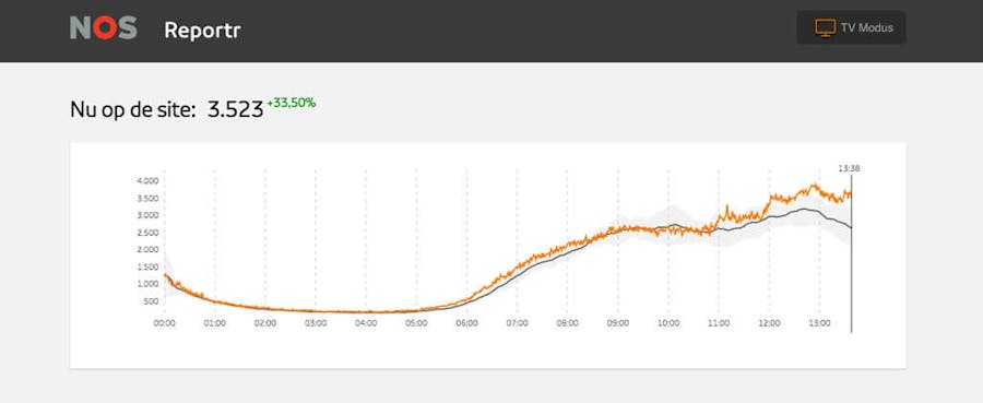
<img alt="Visits spike at 4K around lunch time."
src="graph.jpg">
</picture>
Text below imageThis markup works well for page wide images which adapt to the size of the viewport. But fixed dimensions are no longer an option as we simply don’t know their width. So instead we typically resort to styles for fluid behaviour:
img {
    max-width: 100%;
    height: auto;
}
Which again results in unwanted reflow:
Text above image.
Text below image.
The fixed ratio fix
The dimensions of a responsive image are no longer fixed. But what remains constant is the aspect ratio of the image height divided by its width. An 16:9 image will remain 16:9 on any screen size. We can use HTML and CSS to create a fixed ratio element:
<element class="fixed-ratio fixed-ratio-16by9">
  <element class="fixed-ratio-content"></element>
</element>
.fixed-ratio {
display: block;
position: relative;
height: 0;
overflow: hidden;
}
.fixed-ratio-content {
position: absolute;
top: 0;
left: 0;
width: 100%;
height: 100%;
max-width: inherit;
}
.fixed-ratio-16by9 {
/* ratio: 100% / (16 / 9) = */
padding-bottom: 56.25%;
}This trick is known as the intrinsic ratio or padding-bottom hack. The padding-bottom property is used to define the height as a percentage of its width. The inner element then spans the full width and height of the outer element.
This trick works with any element. So we can adapt it to our picture and image element. We use an inline style to define the padding-bottom as aspect ratios differ per image:
Text above image
<picture class="fixed-ratio"
    style="padding-bottom:41%;">
    <!-- multiple <source>s here -->
    <img alt="Visits spike at 4K around lunch time."
          src="graph.jpg"
          class="fixed-ratio-content">
</picture>
Text below image
Note that we hard-code the padding-bottom to 41%. Fancier would be style="padding-bottom: calc(100%/(990/406))". But using division or multiplication in calc is still unsupported in ~20% of all browsers. So for our site we pre-calculate the padding values server-side.
With the fixed ratio in place our responsive image loads smoothly inside our placeholder:
Text above image.
Text below image.
You can apply the fixed ratio technique to other elements like videos too. The upcoming Twitter Bootstrap v4 even ships with a responsive embed helper using this technique.
What's next?
Our images are already heavily optimised. But we could still save on bandwidth by only loading images just before they enter your viewport. And instead of a solid background we could start with a blurred, very low resolution version of the image inlined as a data uri to improve perceived performance. While we're considering it, you can already read about these techniques in this article on progressive image loading with placeholders.