Aesthetically pleasing real-time data visualisation
Here at De Voorhoede, we primarily write practical front-end code. Imagine our delight when NPO asked us to create a data visualisation: an artistic view of all streams currently playing on the npo.nl platform. All based on realtime data. Now that is a challenge we like!
The television landscape is changing. We move from linear to on-demand. Watch whatever you want, whenever you want. The NPO platform plays a huge role in The Netherlands. You can find anything, from live streams of the traditional channels to specialty channels and episodic content.
From data to visualisation
Together with Hike One and the NPO Marketing Intelligence Team we created a format and implemented it in a couple of days.
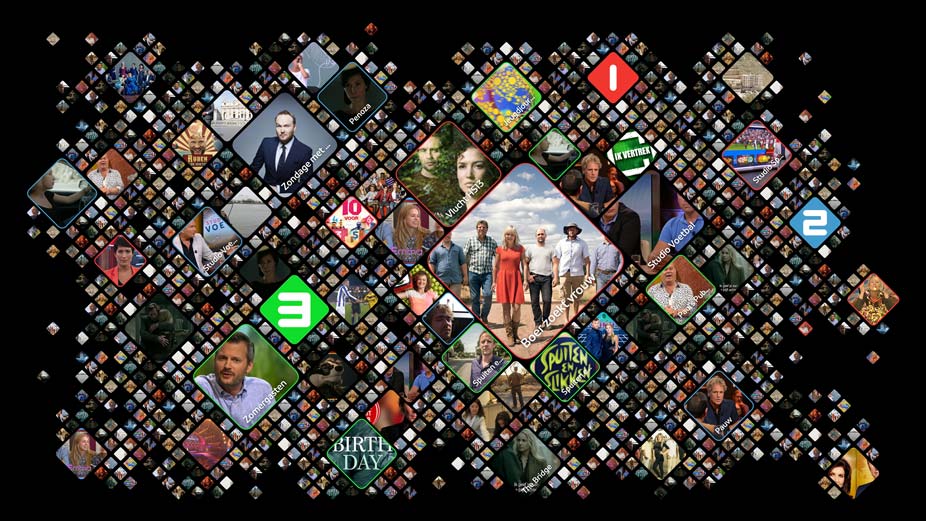
Every stream image gets its place on the screen. The more popular the stream, the bigger that image will be. When another viewer opens the stream the image pulses on screen. Now you have an almost living representation of currently watched streams.
Every data point is delivered via a WebSocket connection. A data point can be anything like the start of a stream or a heartbeat. On a set interval, every video player signals it is still playing. That’s our heartbeat. All these data points (of which there are a lot) make up the data stream our visualisation hooks into.
Put this visualisation on a big screen and you’ve got a beautiful and handy overview of what is being watched!