Experimenting with Web Components in popular JavaScript frameworks
We worked with many JavaScript frameworks over the years - from Angular, React and Vue to the smaller Preact, Riot and Svelte. But these frameworks don't really play well together. So we can't easily use our React components in our Vue apps or vice versa. Enter Web Components, a new player on the web promising to solve interoperability. Define your own HTML elements, for instance a <hue-slider> and use it wherever you like:
We want to know if Web Components live up to their promise. So we did an experiment: create and consume a Web Component using a selection of JavaScript frameworks. In this post we'll share our experience and our verdict. Spoiler: Web Components are indeed very promising and we'll try to find a suitable project for them.
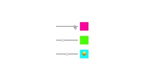
We'll be creating a hue slider to test the core Web Component features:
- Pass values using custom attributes:
<hue-slider value="..."> - Listen to custom events:
document.querySelector('hue-slider').addEventListener('hueChange', ...) - Use slots to transclude content:
<hue-slider>content</hue-slider>
For our experiment we selected the following frameworks: Polymer, React, SkateJS, Stencil, Svelte and Vue.js. As a baseline however we'll start by creating our Web Component using vanilla JavaScript.
Web Component using Vanilla JS
Building a native web component (without any framework) is really fun to do! Since you are writing plain JavaScript, it feels like a mix of old school event handlers with new school ES6 goodness. It is also quite educational as you learn exactly how a web component works. But frameworks exists for a reason, it's very labor intensive and difficult to transpile back to ES5.
Source code (simplified):
class HueSlider extends HTMLElement {
  constructor() {
    super()
    const shadowRoot = this.attachShadow({ mode: 'open' })
    shadowRoot.innerHTML = `
     <label>
        <input type="range" min="0" max="360">
        <output><slot></slot></output>
      </label>
    `
  }
  static get observedAttributes() { return ['hue'] }
  attributeChangedCallback() {  /* ... */ }
  handleInput (event) {
    event.stopPropagation()
    this.dispatchEvent(new CustomEvent('hueChange', this.input.value))
  }
}- Handle custom attributes using
observedAttributesandattributeChangedCallback. - Emit event using
dispatchEvent(new CustomEvent()). - Slotted content using
<slot></slot>.
View the full native component source.
Pros:
- Smallest possible file size
- Close-to-the-metal control over your component
- Vanilla JavaScript
Cons:
- Labor intensive
- Do-everything-yourself, get nothing for free
- Transpilation is difficult
Polymer / LitElement
The Polymer Project created LitElement "A simple base class for creating fast, lightweight web components". Together with the polymer-cli this creates a powerful combination. LitElement is a small base class which gives you the close-to-the-metal feeling but with a reactive renderer.
Source code (simplified):
class HueSlider extends LitElement {
  static get properties() {
    return { hue: { type: String } }
  }
  constructor() {  /* ... */ }
  handleChange(event) {
    /* ... */
    this.dispatchEvent(new CustomEvent('hueChange', this.hue))
  }
  render() {
    return html`
      <label>
        <input type="range" min="0" max="360" value=${this.hue} @change=${this.handleChange} />
        <output style="background-color: hsl(${this.hue}, 100%, 50%);">
          <slot></slot>
        </output>
      </label>
    `
  }
}- Handle custom attributes using
get properties. - Emit custom event using
dispatchEvent(new CustomEvent()). - Slotted content using
<slot></slot>.
View the full Polymer component source.
Pros:
- Close-to-the-metal but without the labor intensiveness of going full native
- Great tooling
- It's easy to create separate bundles for different browser capabilities
Cons:
- Not as feature rich as most front-end frameworks
- Combination of separate projects, all with their own documentation
React
For the React version of our component we used Create React App to quickly get going. We had to use the react-web-component package to wrap our React component into a web component. A side-effect of using React for building web components is that it is included in the resulting output bundle and requires you to have React as an external dependency on the page.
Source code (simplified):
export default class HueSlider extends React.Component {
  constructor(props) { /* ... */ }
  handleChange = () => { /* ... */ }
  webComponentConstructed() { /* ... */ }
  render() {
    const { hue } = this.state
    return (
     <label>
        <input type="range" min="0" max="360" value={hue} onChange={this.handleChange} />
        <output style={{ backgroundColor: `hsl(${hue}, 100%, 50%)` }}>
          { this.props.children }
        </output>
      </label>
    )
  }
}- Handle custom attributes using
propsandwebComponentConstructed. - Slotted content using
this.props.children.
View the full React component source. And read more about React and web components here.
Pros:
- Familiar syntax
- Little additional build steps required
- React as a framework is very mature
Cons:
- No build-in support to create and export web components
- React required as an external dependency
SkateJS
SkateJS positions itself as “a functional abstraction over the web component standards”. It’s close-to-the-metal but some things are being taken care of or are abstracted away. One of the options SkateJS offers is what renderer you would like to use. Also, SkateJS isn’t that well known yet, so there was only little documentation and it wasn’t very extensive.
Source code (simplified):
class HueSlider extends withComponent(withPreact()) {
  static get props() {
    return {
      hue: props.string
    }
  }
  connectedCallback() { ... }
  handleChange = () => { ... }
  render({ hue, handleChange }) {
    return (
      <label>
        <input type="range" min="0" max="360" value={hue} onInput={handleChange} />
        <output style={{ backgroundColor: `hsl(${hue}, 100%, 50%)` }}>
          <slot></slot>
        </output>
      </label>
    )
  }
}
View the full SkateJS component source.
Pros:
- Close-to-the-metal but without the labor intensiveness of going full native
- Choose your own renderer
- Small file size
Cons:
- Very little documentation/reading material
- Not as mature as other frameworks
Stencil
Stencil is a compiler that generates web components. It mixes TypeScript classes with JSX to produce web components. We did not use Stencil before so we needed a bit of getting used to the syntax and build setup.
Source code (simplified):
@Component({
  tag: 'hue-slider-stencil',
  styleUrl: 'hue-slider-stencil.css',
  shadow: true
})

export class HueSlider {
  @Prop({ reflectToAttr: true, mutable: true }) hue: string = '100'
  @State() inputValue: string
  @State() value: string
  @Event({ eventName: 'input'}) inputEvent: EventEmitter
  handleInput() { ... }
  componentWillLoad() { ... }
  @Watch('hue')
  hueUpdated(val) { ... }
  render() {
    return (
      <label>
        <input type="range" min="0" max="360" value={`${this.hue}`} onInput={(e) => this.handleInput(e)} />
        <output style={{ backgroundColor: this.value }}>
          <slot></slot>
        </output>
      </label>
    )
  }
}
View the full Stencil component source.
Pros:
- Fully focused on building web components
- A loader build-in to only load polyfills needed
Cons:
- Not yet mature yet
- Quite a learning curve for those new to TypeScript and JSX
Svelte
Although we have used Svelte before, we tend to use Vue more often for our day-to-day work. However, since they share a quite similar API, working with Svelte is much like working with Vue.
The compiler of Svelte can convert components directly to web components. Having web component support baked into the library.
Source code (simplified):
<label on:input="onInput(e)" on:change="onChange(e)">
  {#if hue}
    <input type="range" min="0" max="360" value="{inputValue}">
  {:else}
    <input type="range" min="0" max="360">
  {/if}
  <output style="background-color: hsl({inputValue}, 100%, 50%)">
    <slot></slot>
  </output>
</label>
<script>
  export default {
    tag: 'hue-slider-svelte',
    data() {
      return {
        hue: '0',
        inputValue: '0',
        value: '0'
      }
    },
    onstate() { ... },
    onupdate() { ... },
    oncreate() { ... },
    methods: {
      onInput() { ... },
      onChange() { ... }
    }
  }
</script>
View the full Svelte component source.
Pros:
- Familiar syntax (Vue like)
- No additional build steps (it's just a config setting)
- Small file size
- Web component support baked into the library
Cons:
- Framework slightly less mature / feature rich
Vue.js
We use Vue.js quite often here at De Voorhoede. So we are comfortable with its syntax and build system. The creation of the component took little effort. To transform the Vue component into a web component, we used the @vue/web-component-wrapper library to wrap our Vue component into a web component. This approach requires you to have Vue as an external dependency on the page.
Source code (simplified):
<template>
  <label>
    <input type="range" min="0" max="360" :value="inputValue" @input.stop="onInput" @change.stop="onChange">
    <output :style="`background-color: hsl(${inputValue}, 100%, 50%)`">
      <slot />
    </output>
  </label>
</template>
<script>
  export default {
    name: 'HueSlider',
    props: ['hue'],
    data: () => ({
      inputValue: null,
      value: '0'
    }),
    methods: {
      setValue() { ... },
      onInput() { ... },
      onChange() { ... }
    },
    mounted() { ... },
    watch: { ... }
  }
</script>- Bind to custom attributes using
props. - Emit custom event using
$emit(). - Slotted content using
<slot/>.
View the full Vue.js component source. And read more about Vue.js and web components.
Pros:
- Familiar syntax
- Little additional build steps required
- Vue as a framework is very mature
Cons:
- VueJS required as an external dependency
Using the generated web components
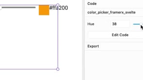
It’s actually quite easy to use web components different frameworks. It mostly boiled down to importing the component and defining it on the page. We could use the web components in Storybook and use some web components in Framer X, an interactive design tool (still in beta).
This means that we can develop components and designers can use these as interactive building blocks within their Framer X project. Very cool stuff!
Final thoughts
The biggest take-away we found was that web components created using Vue and React, had their respective frameworks included in the bundle. Without that, the components would not work. We want to use components without that dependency. Splitting components and framework into separate bundles would be ideal.
We also need to talk about browser support. Native web components are getting better browser support with each new release and by using polyfills and transpiling we were able to get web components to work in most of the major browsers.
A note on performance
We focussed on compatibility and ease-of-use between frameworks during this experiment. Of course we’re also interested in the performance of these frameworks when using web components and the web components they produce. But this will be done in another, more controlled, performance focussed follow-up experiment. Stay tuned...
Want to start with web components yourself? Check out Web Fundamentals, developer.mozilla.org and this video with Paul Lewis.