Just like developing a website back in the 90s
While in the final stretch of a redesign for one of our recent clients, we also had to build their new email templates. In this blog post we will take you through some of the steps, our approach and some of the issues we encountered.
The first thing that defined the scale and difficulty of redesigning their current templates was the new design. The design met some basic rules and standards used for easier email template development.
Here are a few rules and standards we used:
- The design and layout was simple enough to recreate with tables.
- A single-column layout (with a 2-column layout in only a few places)
- The main, centered, content of the email had a max-width of 600 pixels, the rest being just a grey background-color.
- ‘Fluid’ between 320 and 600 pixels.
- Basic CSS properties only. *
- As few images as possible.
*) Since some modern clients support only a handful of CSS3 properties, we use the CSS2.1 specification. Even then, there are some email clients that don’t fully support this older spec.
Getting started
We could start developing the new email templates completely from scratch, this gave us the freedom to create a solid foundation from which we could develop all the new email templates.
Solving our email development problems
When developing email templates for our clients in the past, we ran into some difficulties. We found that the whole development workflow for email templates was quite cumbersome and slow. Especially inlining all the css, getting the styling right in different email clients and testing each change. This eventually turned into an Email Template Guide, which was based on our existing Front-end Guide. We make heavy use of Nunjucks as a templating language, so that we’re able to build reusable components and keep our templates clean and flexible.
Because our client already used our Front-end Guide in their workflow, it was pretty easy for them to see the potential of the Email Template Guide.
HTML base structure
We needed a clear separation of 3 things: the header, footer and main content. All of which would be developed later on as separate components. We used the following base structure:
<body leftmargin="0" marginwidth="0" topmargin="0" marginheight="0" offset="0" yahoo="fix">
  <center>
    <table align="center" border="0" cellpadding="0" cellspacing="0" height="100%" width="100%">
      <tr>
        <td align="center" valign="top">
          <table border="0" cellpadding="0" cellspacing="0">
            <tr>
              <td align="center" valign="top">
              {% Nunjucks views get included here %}
              </td>
            </tr>
          </table>
        </td>
      </tr>
    </table>
  </center>
</body>
We use a <center> element which allows us to center the email, even in old email clients. Then it's basically a <table> in a <table>. Inside the second table we include our ‘view’, which in turn holds all the components it’s comprised of.
The header and footer are included in each view. Not in the base-view, because a template might not need the header or footer, but they would still have been added automatically.
All views and components must start as a <table>. This ensures you will get the best results and least amount of issues when developing your templates.
Core styling
The base styling is mostly fixes and resets for different email clients. A normalize for your templates if you will.
/* Prevent WebKit and Windows mobile changing default text sizes */
body, table, td, p, a, li, blockquote {
  -webkit-text-size-adjust: 100%;
  -ms-text-size-adjust: 100%;

  @media screen and (max-width: $breakpoint-s) {
    -webkit-text-size-adjust: none !important;
  }
}
/* Remove spacing between tables in Outlook 2007 and up */
table, td {
  mso-table-lspace: 0pt;
  mso-table-rspace: 0pt;
}
/* Remove extra pixels in Hotmail to prevent images breaking on high resolutions */
img {
  display: block;
  width: auto !important;
  max-width: 100% !important;
  height: auto !important;
  /* Allow smoother rendering of resized image in IE */
  -ms-interpolation-mode: bicubic;
}
Most notable are the -webkit-text-size-adjust , mso-table-lspace and img fixes. The first 2 will ensure that our font will be rendered in the correct size and the second makes sure there is no extra spacing between tables in Outlook 2007 and later.
The img rule is very important. You might think that including an image and giving it the right dimensions is enough, but some email clients have weird behavior when it comes to images. Setting these properties on all your images makes sure that all the dimensions that you give them will display correctly in all email clients.
Don’t try to reinvent the wheel yourself, especially with these kinds of quirky client specific behaviors. Fixes can easily be found online.
With the base-view and base styling in place, we can create our first template and its components. Here’s an example of a simple email template with 3 Nunjucks component macros:
<table border="0" cellpadding="0" cellspacing="0" width="100%" height="100%">
  <tr>
    <td align="center" valign="top">{{ appHeader() }}</td>
  </tr>
  <tr>
    <td align="center" valign="top">{{ customComponent() }}</td>
  </tr>
  <tr>
    <td align="center" valign="top">{{ appFooter() }}</td>
  </tr>
</table>
Positioning elements
You might have noticed all the attributes we use in our HTML. Because we need to style and position components so that we support older email clients, old (and sometimes deprecated) attributes can be your best friend. That’s why we use tables: The attributes can be used for positioning the content:
<table cellpadding="0" cellspacing="0" width="100%" height="100%">
  <tr align="left" valign="center">
    <td align="left" valign="top" height="[number]">Some text that we need to position and style.</td>
  </tr>
</table>
We always use these attributes and values to create an equal starting point for each template, it’s components and the content. The attributes on the <tr> and <td> are used to position the cells and their content. With our core-styles, base-view and consistent use of these attributes we now have a solid foundation.
Styling elements
Because we use the Email Template Guide, we can write our styling as SCSS. The guide inlines everything automatically. After applying some styling, our previous example now looks like this:
<table cellpadding="0" cellspacing="0" width="100%" height="100%">
  <tr align="left" valign="center">
    <td align="left" valign="top" height="[number]"
        style=”-ms-text-size-adjust:100%;-webkit-text-size-adjust:100%;box-sizing:inherit;color:#333333;font-family:Arial,Helvetica,sans-serif;font-size:16px;font-weight:normal;height:50px;line-height:24px;mso-table-lspace:0pt;mso-table-rspace:0pt;padding:0;”>Some text that we need to position and style.</td>
  </tr>
</table>
Did you spot our client-specific fixes from the base-view? Can you imagine having to copy/past those for every <td> element?
Responsive behaviour
Now that my component has some styling, what about fluid behavior like media queries? Yes, you can use media queries in email templates. Just keep in mind that older email clients don’t support media queries. Most newer clients and devices like phones and tablets do support them.
The package used for inlining styling didn’t keep media queries intact, so I created our own gulp task that got all our media queries across multiple files and put them in the <head> inside a <style> tag.
<head>
  <meta http-equiv="Content-Type" content="text/html; charset=utf-8"/>
  <meta name="viewport" content="width=device-width, initial-scale=1"/>
  <title>Email template</title>
  <style type="text/css">
    @media screen and (min-width: $breakpoint-s) {...}
    @media screen and (min-width: $breakpoint-m) {...}
    [...]
  </style>
</head>
We could have used <link rel="stylesheet" href="path/to/mediaqueries.css"> to link to our file containing all our media queries, but support for this is even lower.
Images and icons
At the Voorhoede we are big fans of SVG icons. So the first the thing we tried was using SVG’s for all icons in the template. We included icons with a .png fallback. While our fallback did work, it didn’t work the way we expected. It only worked sometimes or not at all. Older email clients show both the SVG as a broken image and the .png version next or below it. We abandoned this approach and just use small .png’s for icons. All other images would still be .jpg’s.
Keep file-size in mind while working with images in emails. Because the bigger the email, the longer it takes to download, the same as with websites. And some email clients enable people to show the email without downloading the images and other assets.
To keep the email size down and making sure the email doesn’t look broken when no images are displayed we did 2 things:
- We created a Gulp-task that would minify all images. We also resized all the images, so a ‘full-width’ image would be no more than 600 pixels wide.
- We made sure that the images would have their dimensions set in the HTML and CSS. So when the images was not loaded, it would still take up it’s intended space.
Using this combination, we would always have solid image dimensions. Even if the image is loaded or not.
<img class="icon" width="24" height="24" src="path/to/image.png" alt="logo" hspace="0" vspace="0">.icon {
display: block;
width: 24px;
max-width: 24px;
height: 24px;
max-height: 24px;
}Note: setting the hspace and vspace attributes to 0 will make sure that email clients don’t add any extra space around the image.
Buttons
The last thing worth mentioning is buttons/links. Normally you would create either a <button> or <a> , and give .button-primary the styling you need. To get them look good in email clients we needed to rethink the way we create buttons in HTML.
We decided to make a ‘button’ component that could be used throughout the templates. We created variables for all aspects of the button. Colors, widths, heights and text, the button could look like anything we wanted. To accomplish this we can use a <table>, again. We ended up with the following structure:
<table class="button {{btnClass}} {{type}}" border="0" cellpadding="0" cellspacing="0" style="width:{{width}}; height:{{height}}; background-color:{{btnColor}};">
  <tr align="center" valign="center">
    <td align="center" valign="center" style="width:{{width}}; height:{{height}}; color:{{textColor}};">
      <a href="{{link}}" target="_blank" style="color:{{textColor}};">
        <span>{{text}}</span>
      </a>
    </td>
  </tr>
</table>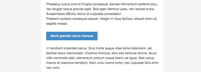
It looks like a button/link, works like one and is displayed correctly in all email clients.
Testing our templates
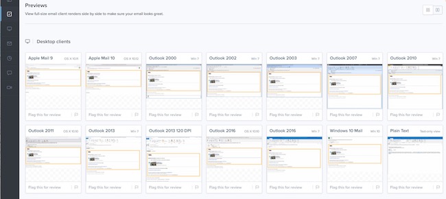
We need to make sure our new templates display correctly in all the different email clients we needed to support. For testing we used the built-in test feature. It uses Litmus. You can read all about it in the blog postabout the the Email Template Guide. We first tested our core-styles and base-view template. When this foundation is solid, we only need to test the main content of each new email template. During this initial testing we ran into some issues.
Images
One of the first things we ran into was that we needed to store our images on a server for them to show up in the Litmus tests. src="../assets/logo.png" worked during local development, but showed a broken logo in the Litmus test results.
Our solution: use placeholder images during the tests. With src="http://placehold.it/24x24" we could see images in our Litmus tests. After finishing the template, testing and fixing any bugs, we replaced the placeholder images with the actual images.
Spacing
The second issues we had to solve was horizontal/vertical spacing between elements. Because we couldn’t rely on margin/padding (see Email Client CSS Support) we needed a different cross-client solution. Our solution: tables. We could use table-rows and table-cells to our advantage.
For horizontal spacing, we created a new <table> with a single <tr>with an empty <td> inside it, and used CSS to give the <tr> it’s height. You can use the height attribute if you need a single height for all screen sizes.
<table border="0" cellpadding="0" cellspacing="0" width="100%" height="100%">
  <tr align="left" valign="center">
    <td class="top-spacing"></td>
  </tr>
</table>
.top-spacing {
height: 12px;
@media screen and (min-width: $breakpoint-s) {
height: 50px !important;
}
}Note: !important is used because height: 12px; gets inlined and the media query needs to overwrite it.
For vertical spacing however, we need a bit more code to get it to work correctly in all email clients. We had to use ‘s to create the space on email clients that ignored all our styling and attributes. Not a really clean solution but it worked perfectly.
<table class="email-footer-hero">
<tr>
{% 'social-icon' truncated... %}
<td class="spacing" align="center" valign="center" width="8">
</td>
<td class="social-icon" align="center" valign="top" width="44">
<a href="https://twitter.com">
<img width="44" height="44" src="http://placehold.it/44x44" alt="twitter logo" hspace="0" vspace="0">
</a>
</td>
<td class="spacing" align="center" valign="center" width="8">
</td>
{% 'social-icon' truncated... %}
</tr>
</table>.email-footer-hero {
.social-icon { width: 44px; }
.spacing { width: 16px; }
img {
min-width: 44px;
height: 44px;
min-height: 44px;
}
a { width: 44px; }
}Conclusion
As you can see, developing email templates takes time and creative thinking to solve the issues like we encountered. The Email Template Guide allows us to set up a solid development environment to create and deliver fully tested templates easily and quickly.
Even when creating a whole email campaign with a lot of different templates, creating and maintaining them is now a breeze.
To see everything we covered in action, check out the Email Template Guide on our GitHub.
Our future plans
We think our Email Template Guide is still maturing into something even more exciting. Take a look at our to-do list or our open issues. If you have any tips or things you want to see implemented please let us know.