
What if you could build a universal Design system with React and use it in any web application or framework? We achieved this by compiling React to Web Components. This is how.
For a customer’s design system we needed a universal solution to author its components once and use them in different web applications built with different web frameworks. Our idea was straightforward: author the components in one framework - React - and use a combination of wrappers, polyfills and tooling to make them work in every context. The implementation turned out tougher than we anticipated. But we’re happy with the result and happy to share what we learned in the process.
The concept
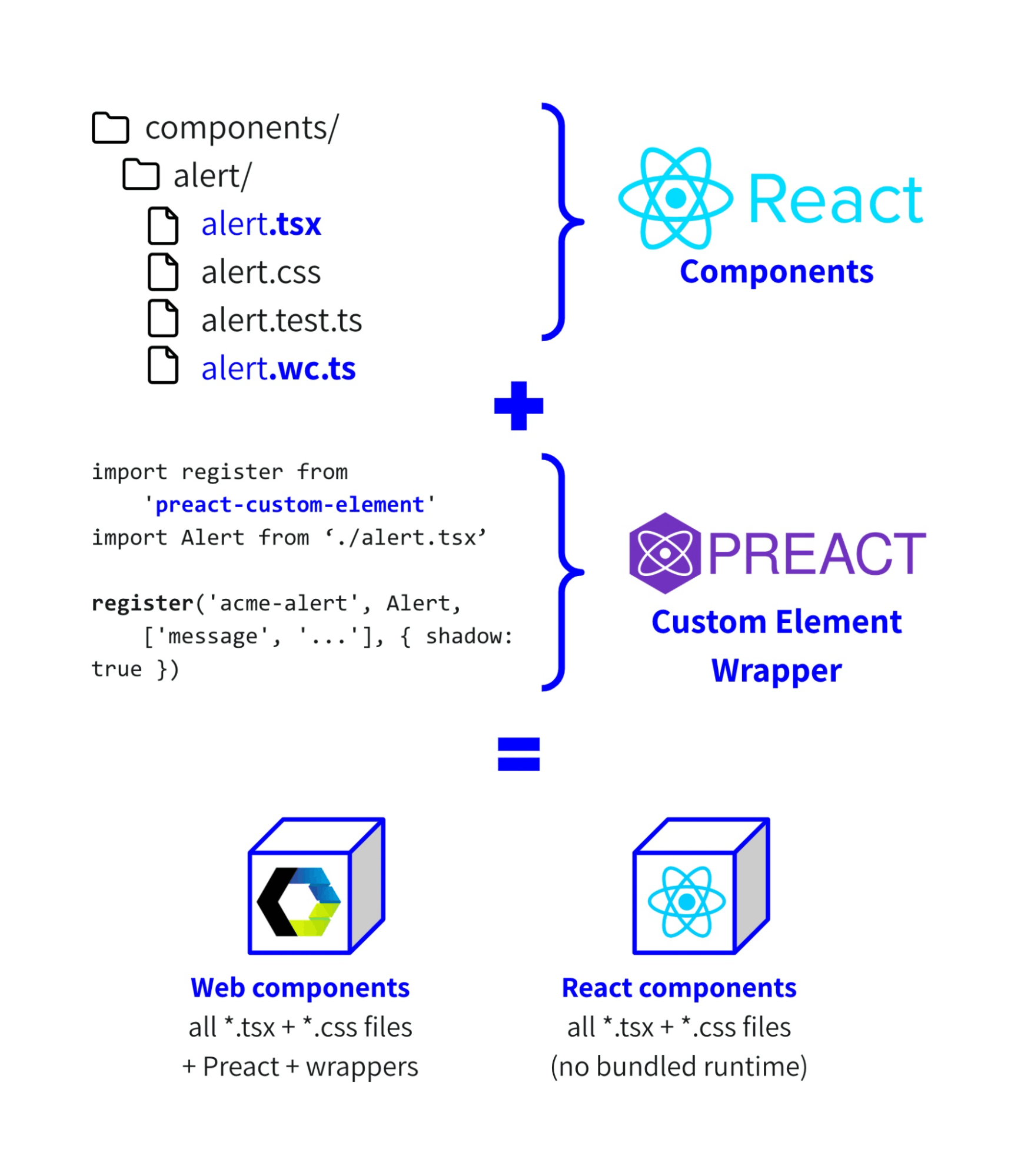
In our blog post How to select a framework for design system components we described different concepts to create universal components, one of them using React. In a nutshell: we author components in React (.tsx files) and compile them to Web Components using wrappers (.wc.ts files) combined with Preact Custom Element. This makes the design system available as React components for React applications and Web Components for all other applications:
We’ll focus on the Web Components making the design system universally available. Let’s dive a bit deeper into how this concept works. First off, Preact can replace React and has two notable benefits: “Preact's tiny size and standards-first approach make it a great choice for building web components”. Since a design system typically doesn’t need the bells and whistles React may provide, Preact is a great option for us.
Substituting React with Preact can be achieved using tooling configuration like in Vite, Rollup or a package.json:
{
  ...
  "alias": {
    "react": "preact/compat",
    "react-dom": "preact/compat",
    "react/jsx-runtime": "preact/jsx-runtime"
  },
  ...
}
With Preact configured we can now turn a React component into a Web Component. We’ll bundle all related files in a directory. Take for example a component to display an alert message to the user:
components/alert/
    alert.tsx    ← React component
    alert.css    ← component styles
    alert.wc.ts  ← Web Component wrapper
Note: We always use Typescript to author design systems to provide the best experience for developers consuming the design systems packages. But to keep our examples simple and concise we’ve left out their typings. We’ll also call our example design system ACME and use `acme` as a prefix everywhere.
alert.tsx - author component using React:
// alert.tsx
import './alert.css’

const Alert = ({ children, type = ‘info’ }) => (
  <div className={`
    alert
    alert--type-${ type }
  `}>
    { children }
  </div>
)
alert.wc.ts - register React component as Web Component using Preact Custom Element:
// alert.wc.ts:
import register from 'preact-custom-element'
import Alert from ‘./Alert.tsx’

register(Alert, 'acme-alert’, [‘type’], { shadow: true })
Use as Web Component in any HTML page or other framework:
<!-- in any HTML page: -->
<acme-alert type=”warning”>My message.</acme-alert>
The reality
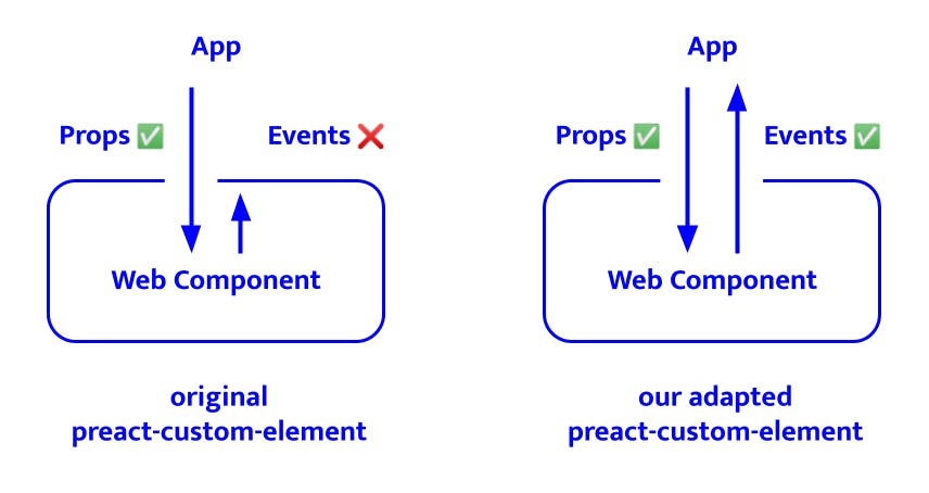
When we started building our components, we quickly came to the conclusion that preact-custom-element does not fit our needs. It appears to be designed to build standalone (web) components, whereas we want to build a system of components that can include styles and interact with each other. To achieve this we customised preact-custom-element and added functionality to support event handling and include styling.
Adding support for event handling
Because our components function as building blocks, we want them to be able to communicate with each other. Attributes are already converted to props by preact-custom-element, but we also need to communicate the other way around:
For example we want to add a dismiss button to our alert component:
// alert.tsx
import './alert.css’

const Alert = ({ children, type = ‘info’, onDismiss }) => (
  <div className={`
    alert
    alert--type-${type}
  `}>
     { children }
	   <button type=”button” onClick={onDismiss}>
        Dismiss
     </button>
  </div>
)
To make this work we added a configuration option called eventNames:
// alert.wc.ts:
import register from '@acme/register'
import Alert from ‘./Alert.tsx’

register({
  component: Alert,
  tagName: 'acme-alert',
  propNames: [‘type'],
  eventNames: ['onDismiss'],
  shadow: true,
});
The way this works is that we create a proxy function for these callbacks, which will emit a custom event when this function is called. The name of this custom event is generated from the value passed to eventNames. In our case ‘onDismiss’ becomes ‘acme-dismiss’. This is a custom event name to prevent conflicts with bubbling events from the web component, which are different from the events emit. With this change we now support event handling and it can be used like this:
// anywhere
<acme-alert type=”warning”>My message.</acme-alert>
<script>
document.querySelector(‘acme-alert’)
  .addEventListener(‘acme-dismiss’, (event) => ...)
</script>
Adding support to include styles
The web components we build should not be polluted by existing styles on a page as we want our design system components to be usable anywhere. While preact-custom-element supports enabling Shadow DOM to keep out unwanted styles, it doesn’t provide a way to include the styles we do want. So we further customised our preact-custom-element helper:
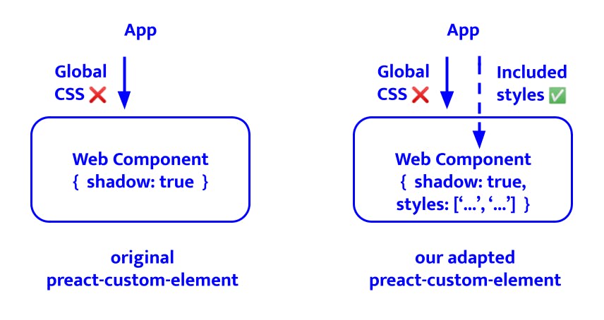
We allow registering a new Web Component with a list of inlined styles:
// alert.wc.ts:
import register from '@acme/register'
import Alert from ‘./Alert.tsx’
import alertStyles from './alert.css?inline'

register({
  component: Alert,
  tagName: 'acme-alert',
  propNames: [‘type'],
  eventNames: ['onDismiss'],
  styles: [alertStyles],
  shadow: true,
});
While our example component only has a single stylesheet, other components may depend on multiple stylesheets like an input component requiring input and (shared) label styles. Stylesheets that are required by all components in the design system (like reset styles) are included within the register helper itself, so they don’t have to be registered in every individual component. Within the register helper all styles are combined into a Constructible Stylesheet. It looks something like this:
// handling styles inside @acme/register:
const sheets = [
  resetStyles,
  otherHelperStyles,
  ...this.styles, // passed via register
].map((styles) => {
  const sheet = new CSSStyleSheet();
  sheet.replaceSync(styles);
  return sheet;
});

this.root.adoptedStyleSheets = sheets;
As support for Constructible Stylesheets in Safari is currently experimental, this requires a polyfill for now:
import 'construct-style-sheets-polyfill'The optimisation
At this point our React components successfully compile to Web Components, so we could stop here. But as we always strive to deliver high performance projects, we still have work to do.
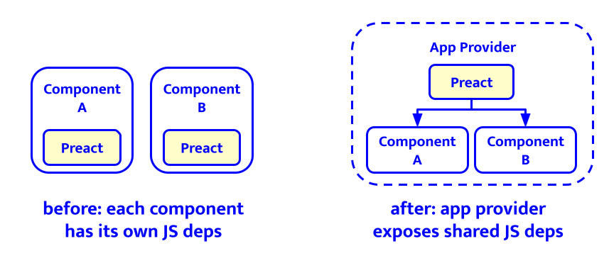
An app provider for shared JS dependencies
With our working setup each component bundles its own Preact runtime. And while at 4kb minified and gzipped Preact is tiny in comparison to React’s 45kb (core + DOM), it still adds up when we have dozens of components.
Bundling Preact in every component has the upside that every component can function in isolation. It also means that if a team implements ten of our components, they would add 40kb (gzipped) to their bundle. This extra bundle size just consists of ten times the same instance of Preact. Time to optimise this!
To solve this we created an 'app-provider' that imports Preact once and makes it available to all its child components:
We can use it like this:
// provider loads and exposes Preact
<acme-app-provider>
  <acme-component-a>...</acme-component-a>
  <acme-component-b>...</acme-component-b>
  <acme-component-c>...</acme-component-c>
</acme-app-provider>
The 'app-provider' imports React and ReactDOM (which are being aliased to Preact, as described above) and attaches it to the window object. We prefix it with our library name to rule out the possibility that it conflicts with existing properties.
import React from 'react'
import ReactDOM from 'react-dom'
import { register } from '@acme/register'

// we also include other shared dependencies, like:
import 'construct-style-sheets-polyfill'

window.__ACME__React = React
window.__ACME__ReactDOM = ReactDOM

const AppProvider = ({ children }) => {
  return <>{children}</>
}

register({
  component: AppProvider,
  tagName: ‘acme-app-provider'
  options: { shadow: true },
})
Since we’ve configured aliases for React to Preact the app provider actually bundles Preact. Finally the (Rollup) build for all other components is configured to use the globally exposed React(DOM):
return {
  output: {
  format: 'iife',
  // add an exception for our app-provider, as
  // it provides React instead of consuming it
  ...(!isAppProvider && {
    globals: {
      'react': '__ACME__React',
      'react-dom': '__ACME__ReactDOM',
    },
  }),
  // ...
}
Now all components nested within the app provider share a single version of each JS dependency.
A theme provider for shared CSS
The Shadow DOM prevents us from sharing common CSS between components the same way we do for JS dependencies. However all our design system tokens - defined as custom CSS properties - can pass the Shadow DOM. We therefore extract these custom CSS properties from all components and make them available through a single shared theme provider:
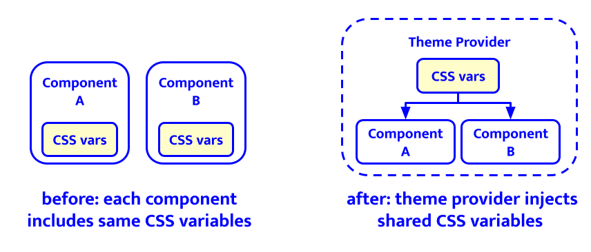
We can use it like this:
// provider includes and exposes CSS variables:
<acme-theme-provider>
  <acme-component-a>...</acme-component-a>
  <acme-component-b>...</acme-component-b>
  <acme-component-c>...</acme-component-c>
</acme-theme-provider>
An extra benefit of this theme provider is that we can more easily add a light/dark theme switch in the future.
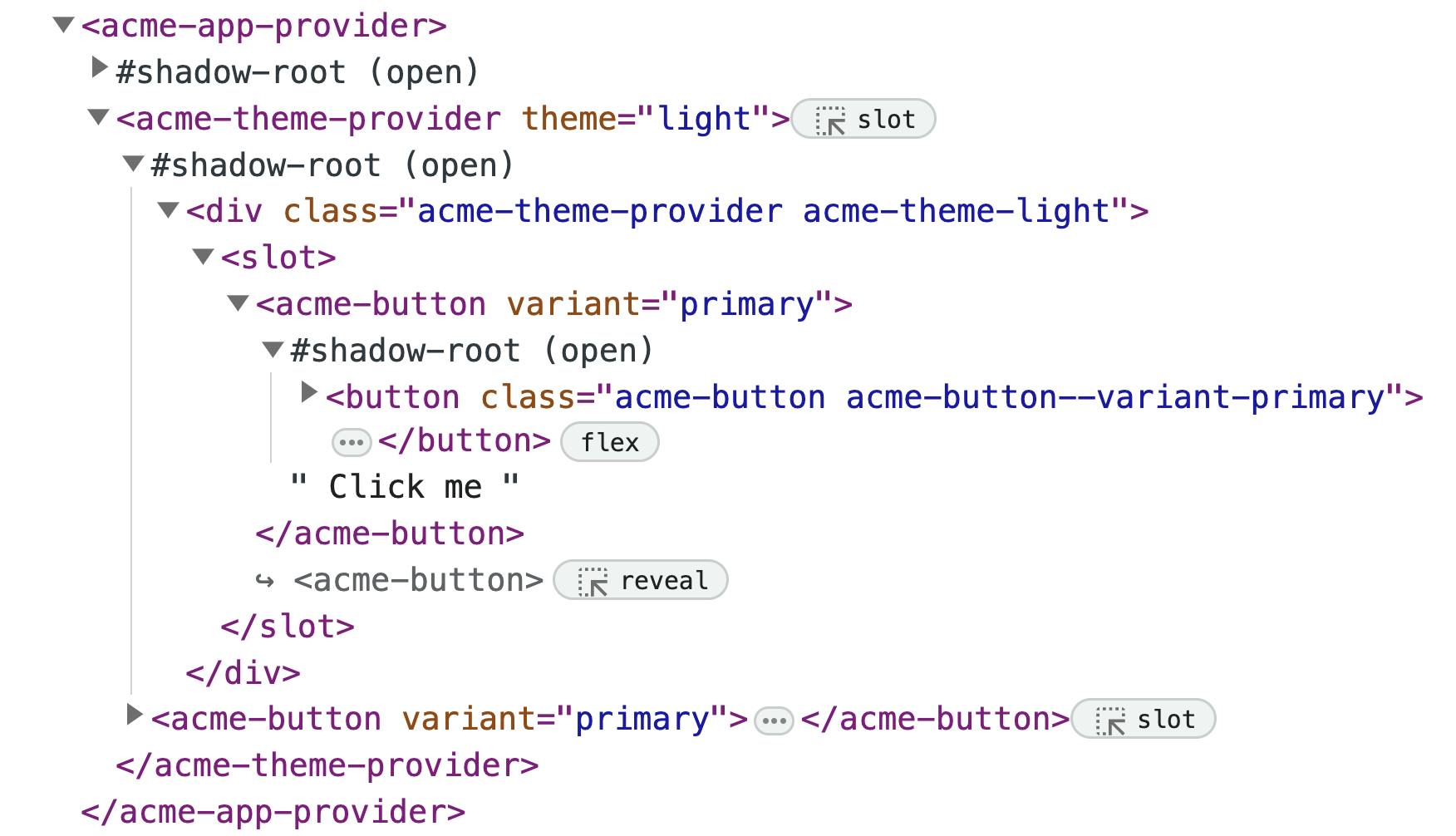
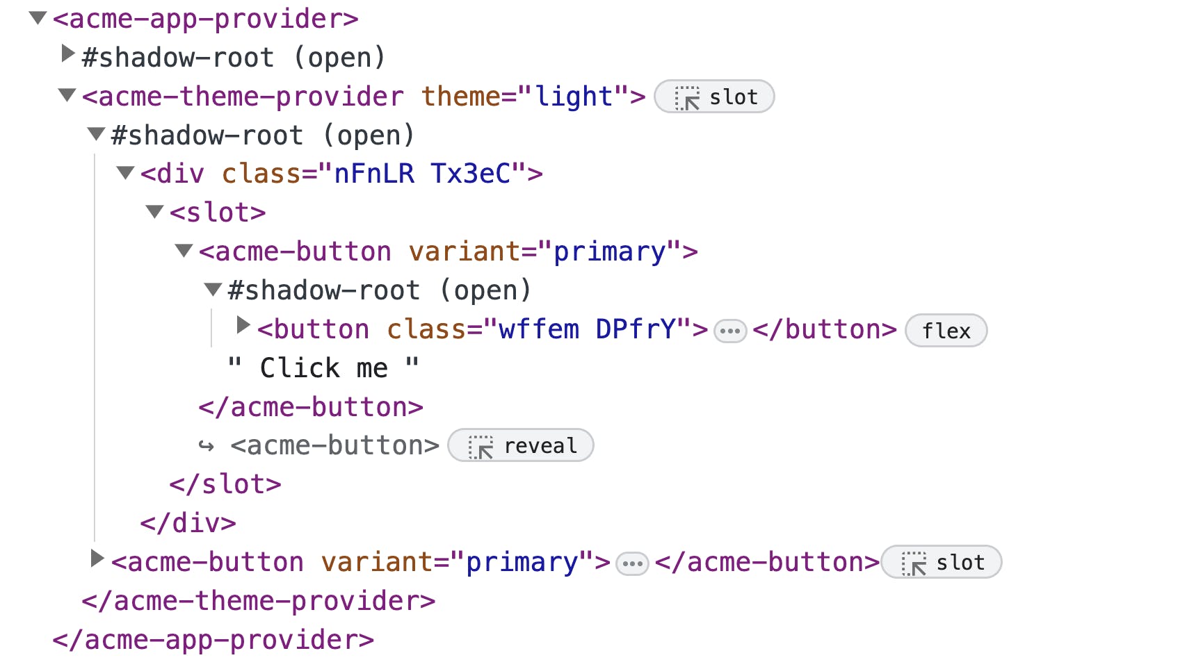
Optimising CSS class names
There’s one more thing we want to optimise: CSS class names. We value clear naming of our components and all their parts, especially in a design system. While this is important in development and documentation we prioritise end user experience in production. And for production these class names can be anything as they’re scoped and can’t have conflicts. As long class names bloat the HTML and stylesheets, we decided to minimise them for production, saving roughly another 5% of the total bundle size of our design system.
Wrapping up
Putting it all together we now have a design system with components that can be used anywhere. We have a custom compiler to turn React components into Web Components with support for scoped styling and event handling. And we’ve extended our setup with a shared app and theme provider to optimise the bundle size of our design system.